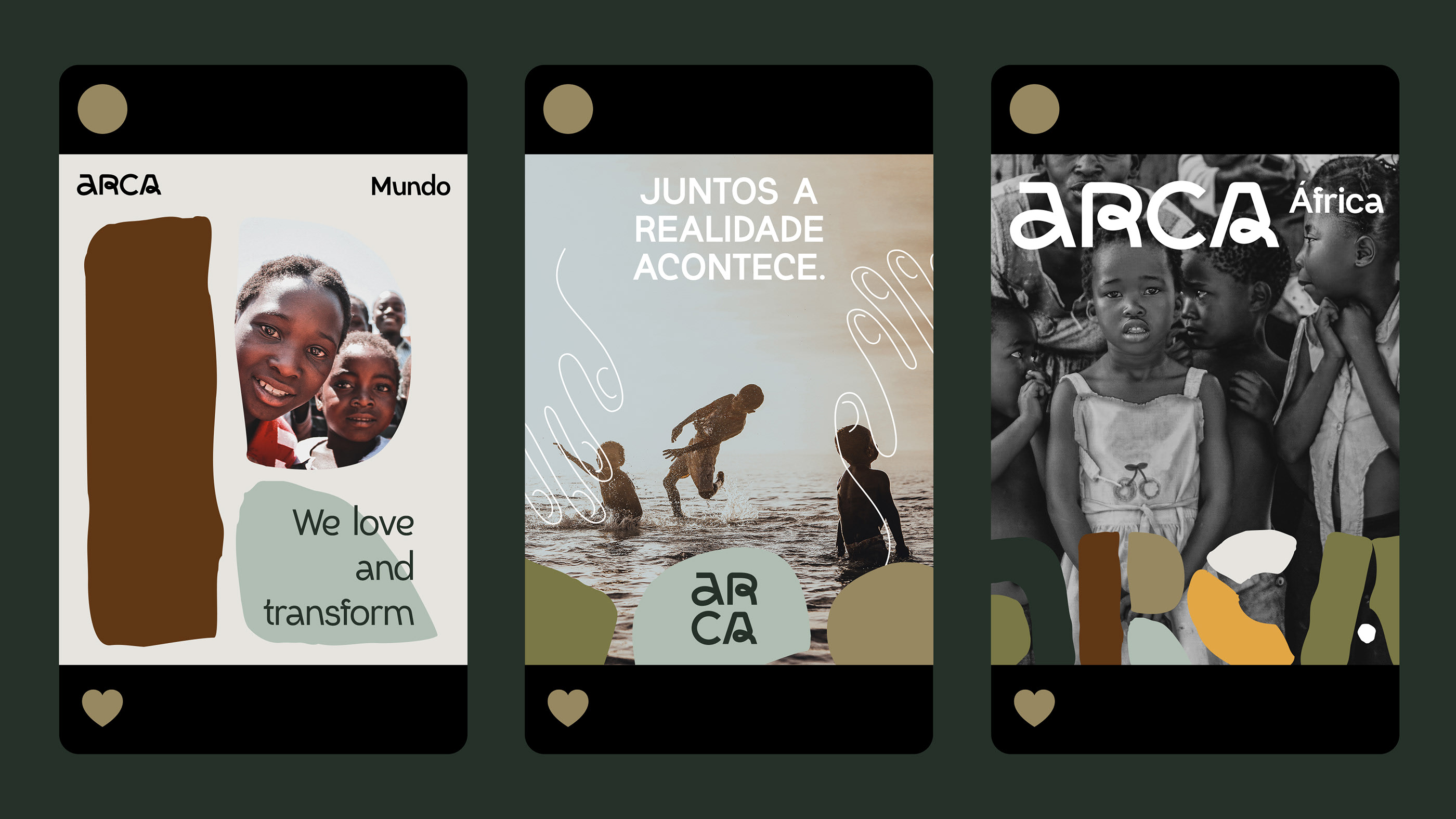
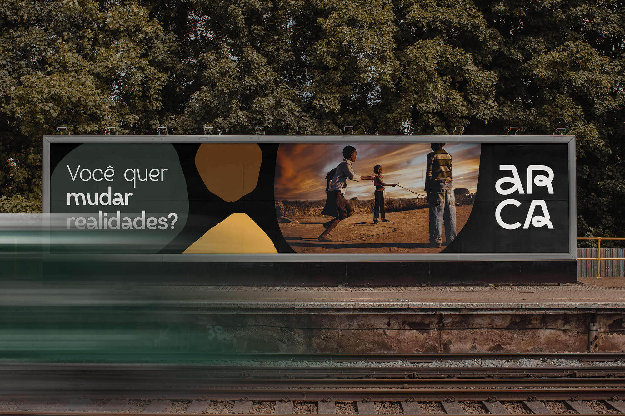
“对需要帮助的人的生活产生影响。”
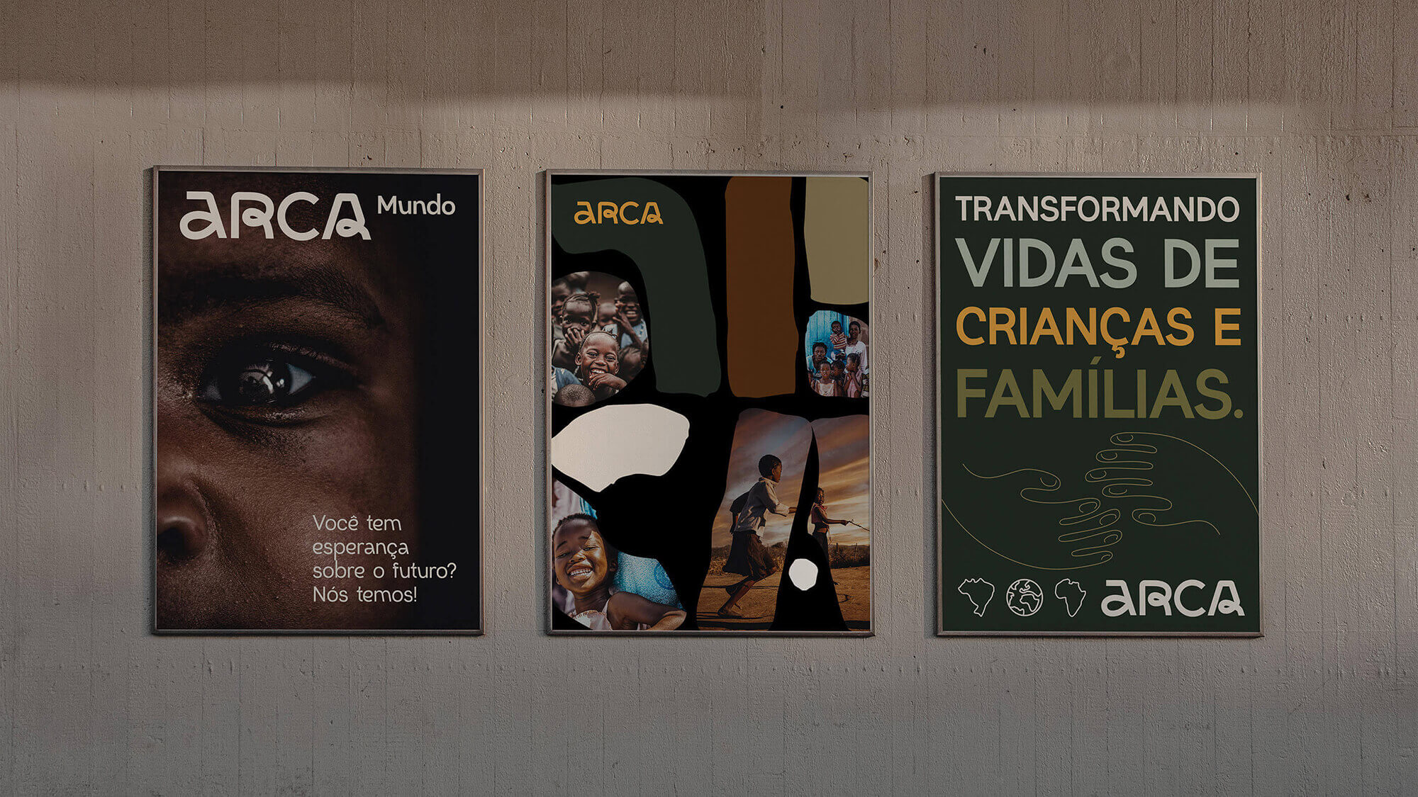
Arca 是一个出生于巴西瓜拉帕里/ES 的非政府组织,它在非洲的莫桑比克以及未来在世界各地发展和运营。
带着改变贫困状况的理想,改变伴随这幅画而来的所有罪恶,例如:低营养、低教育、文盲和犯罪。这些人需要机制、资源和心理支持来改变这种状况,而 Arca 致力于提供支持,以便这些人能够摆脱这种脆弱的局面。
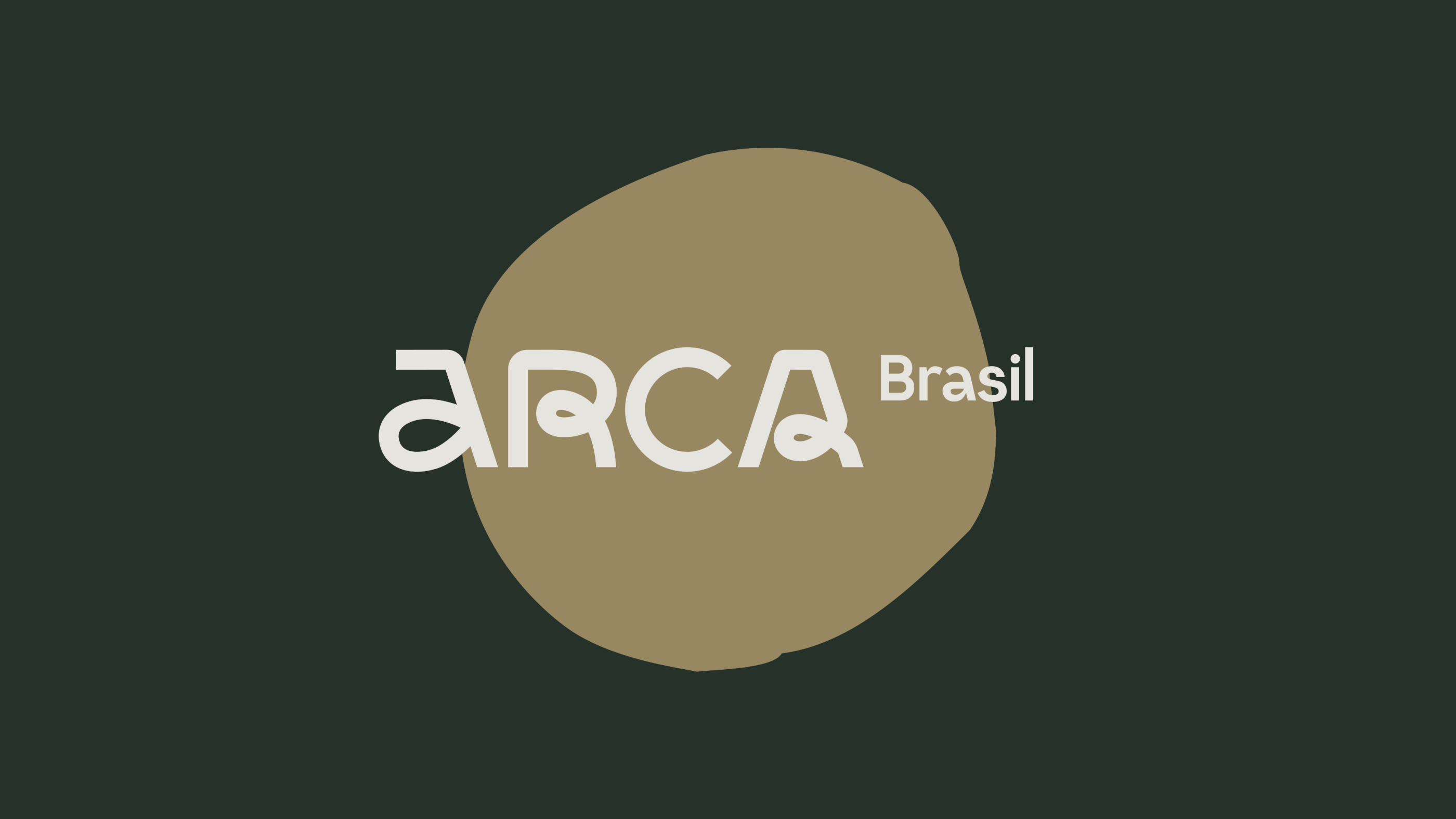
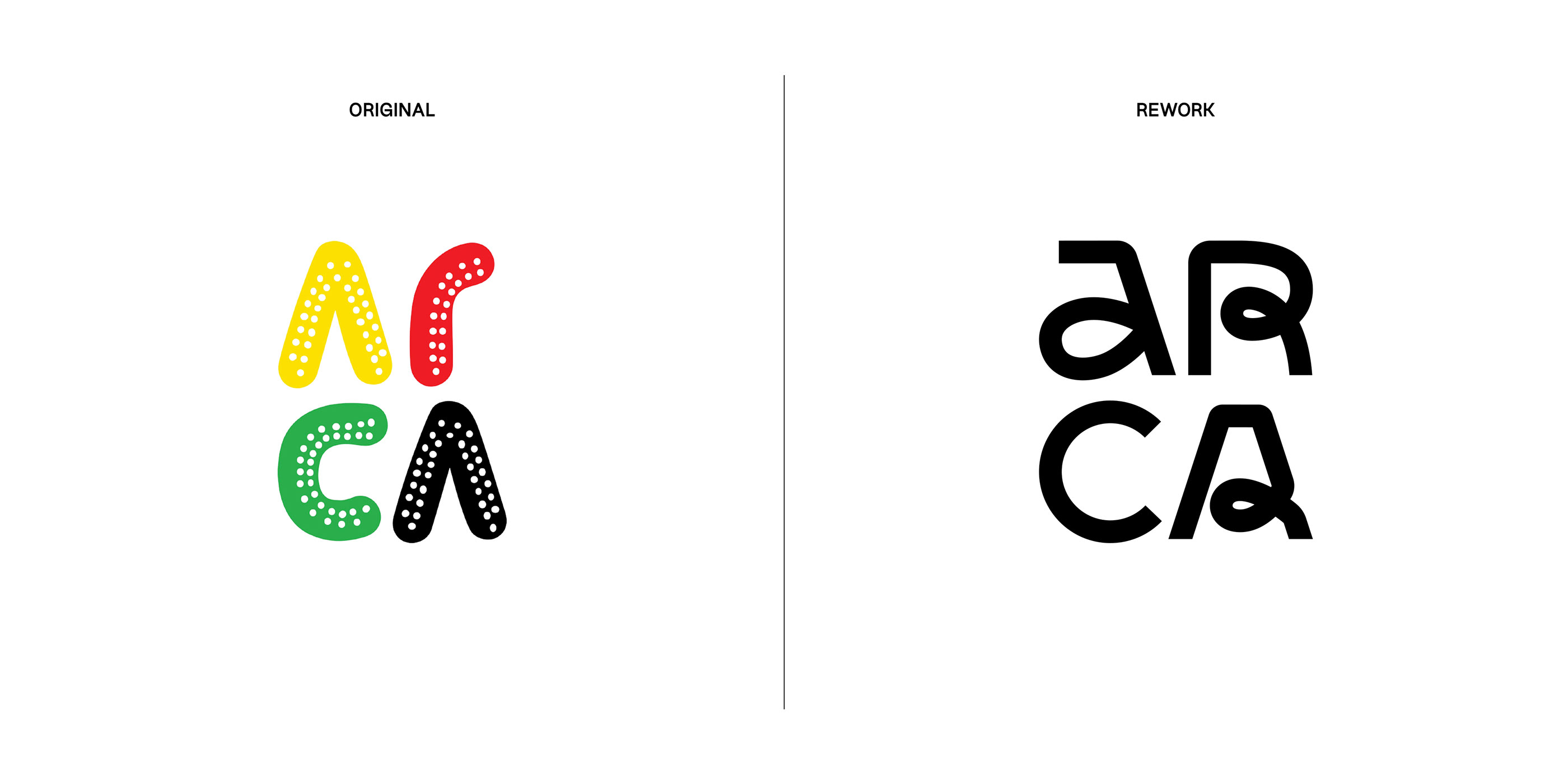
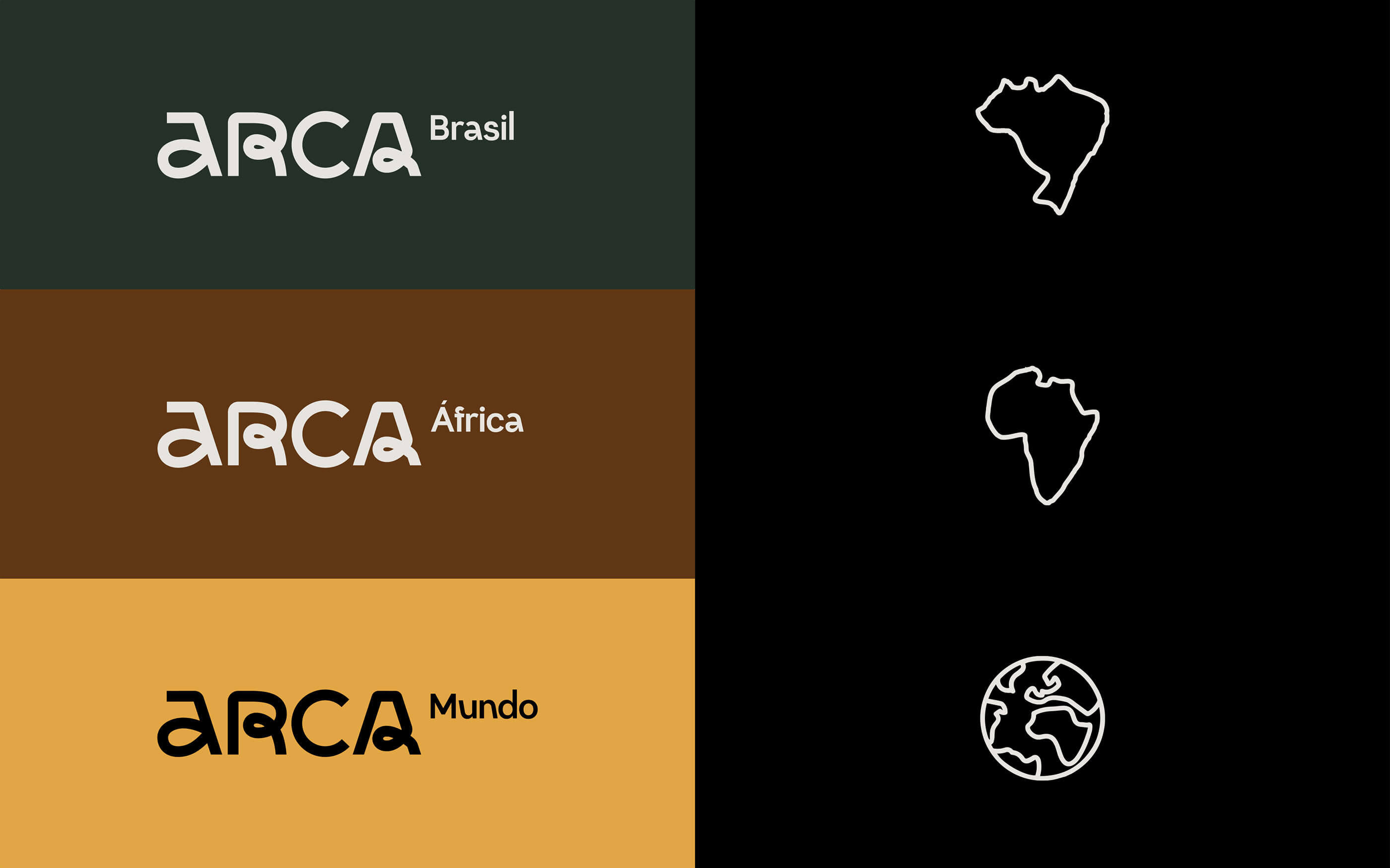
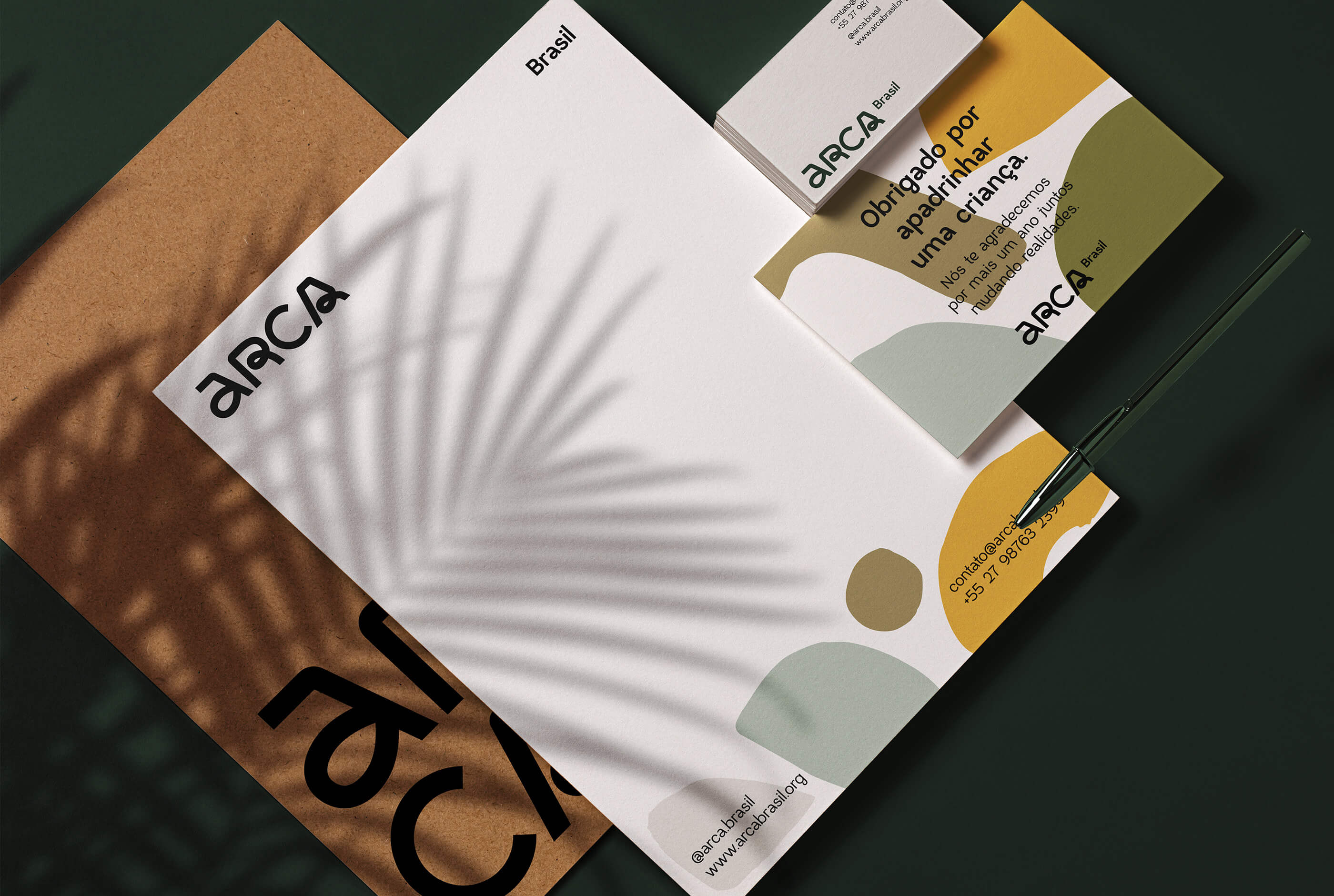
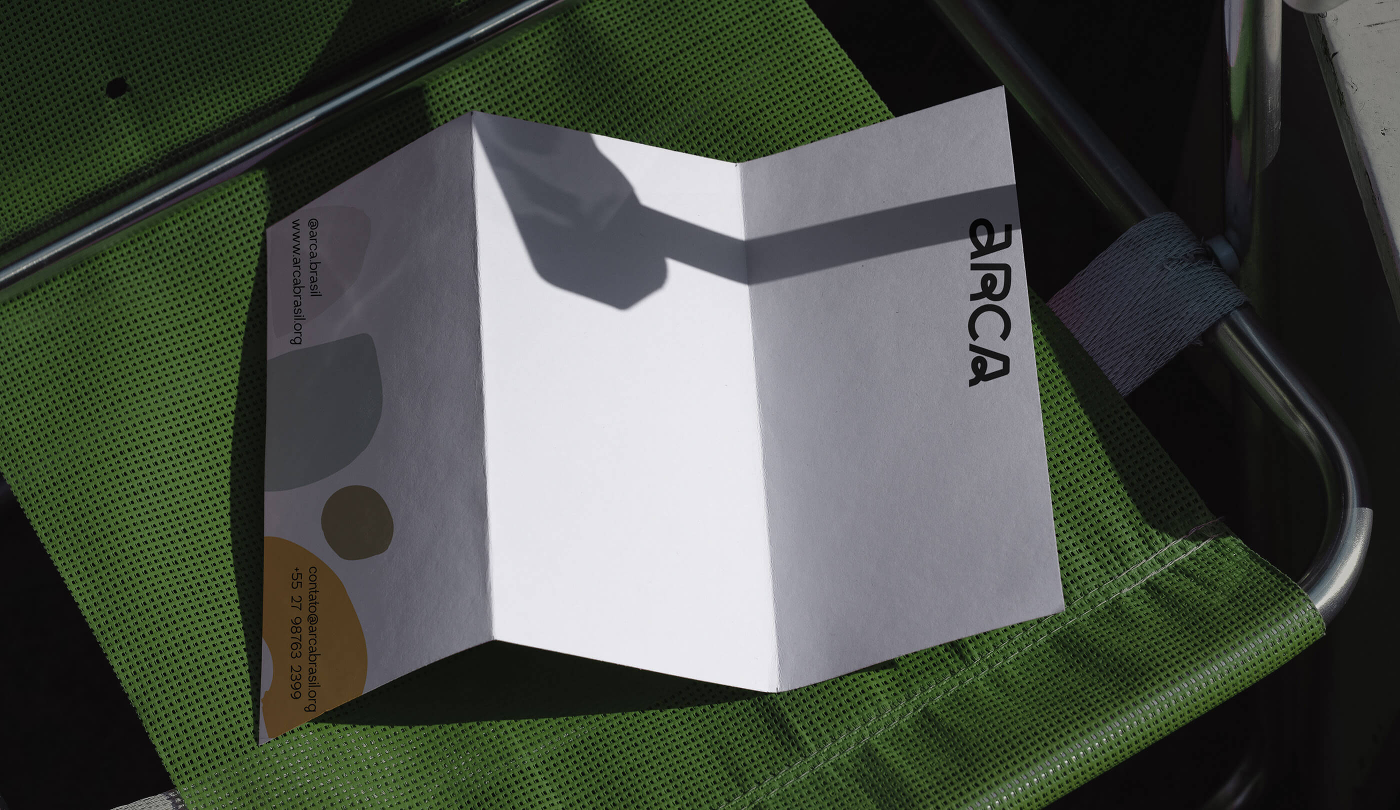
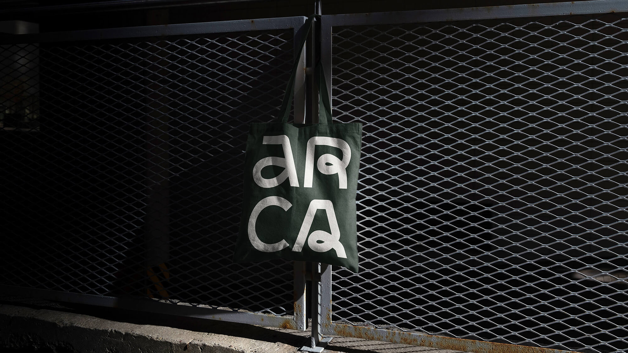
我们试图创建一个视觉标识,其主列是一个干净简约的标志,与以前的标志不同,这个新标志提供了一个更容易的应用和阅读,除了更现代,不同于以前更质朴的标志。
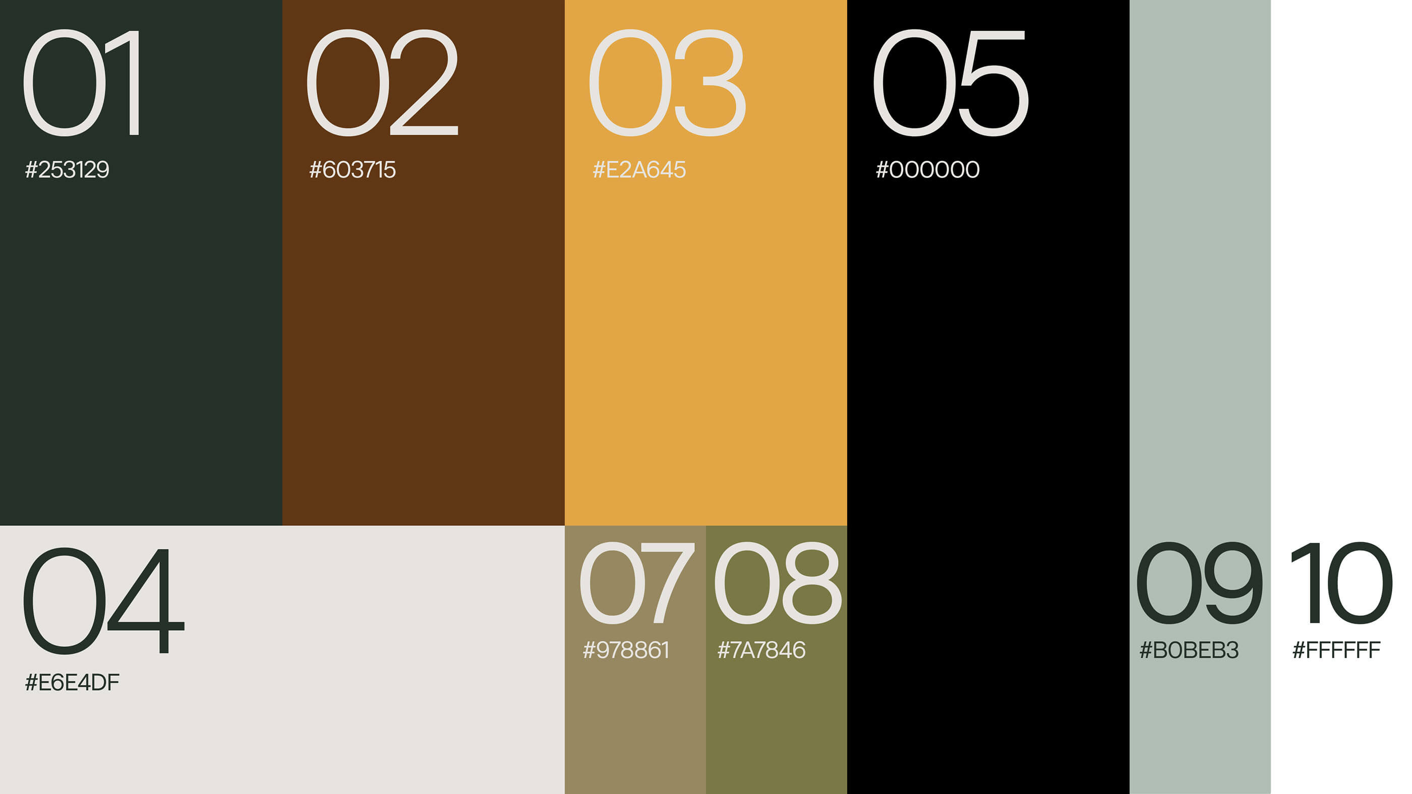
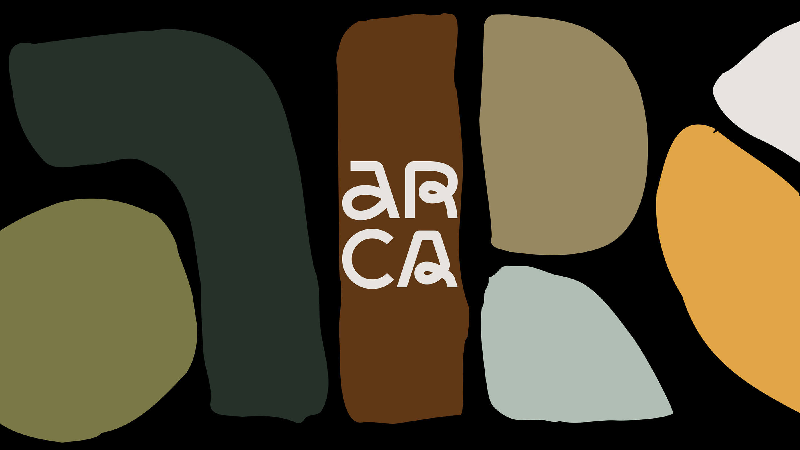
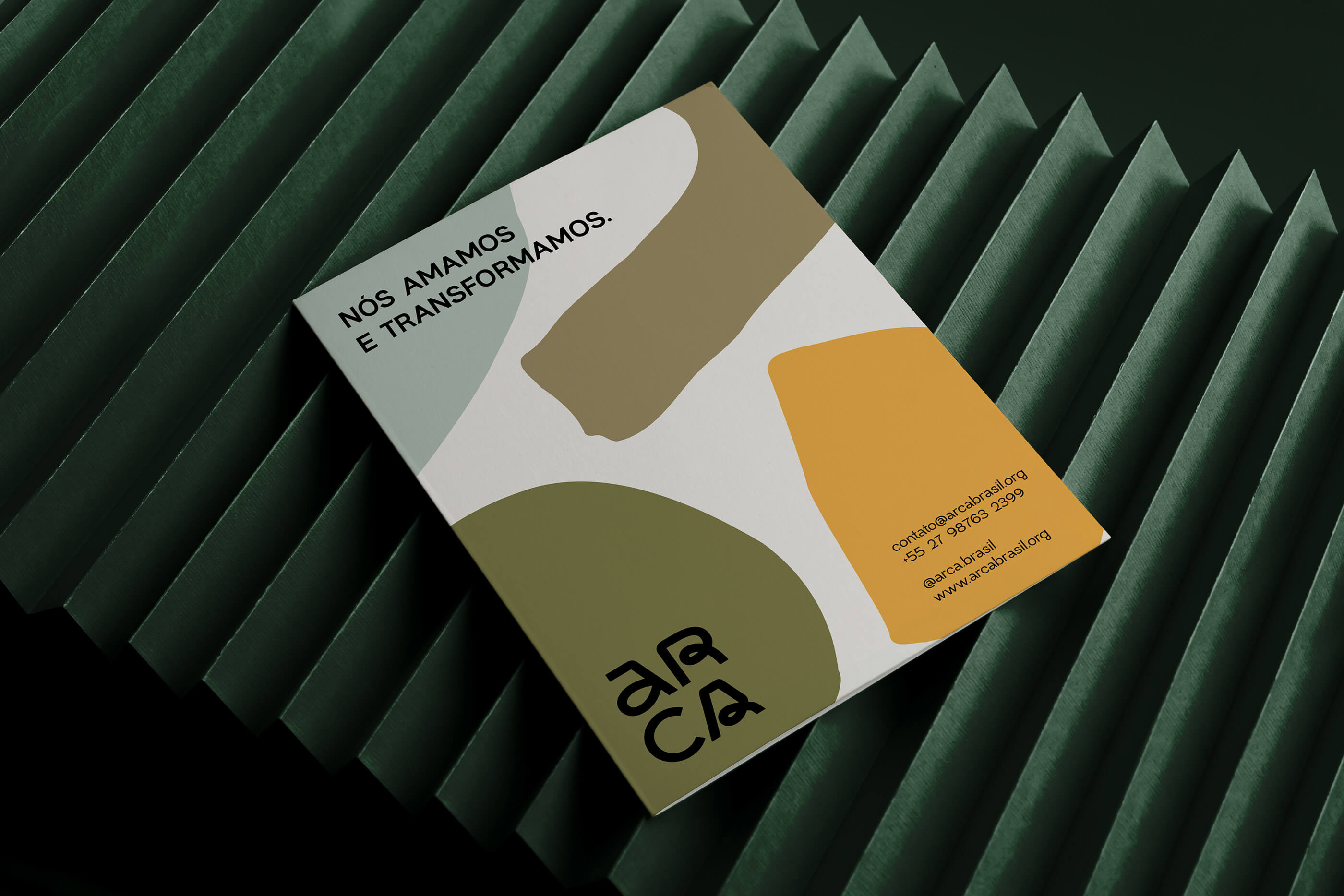
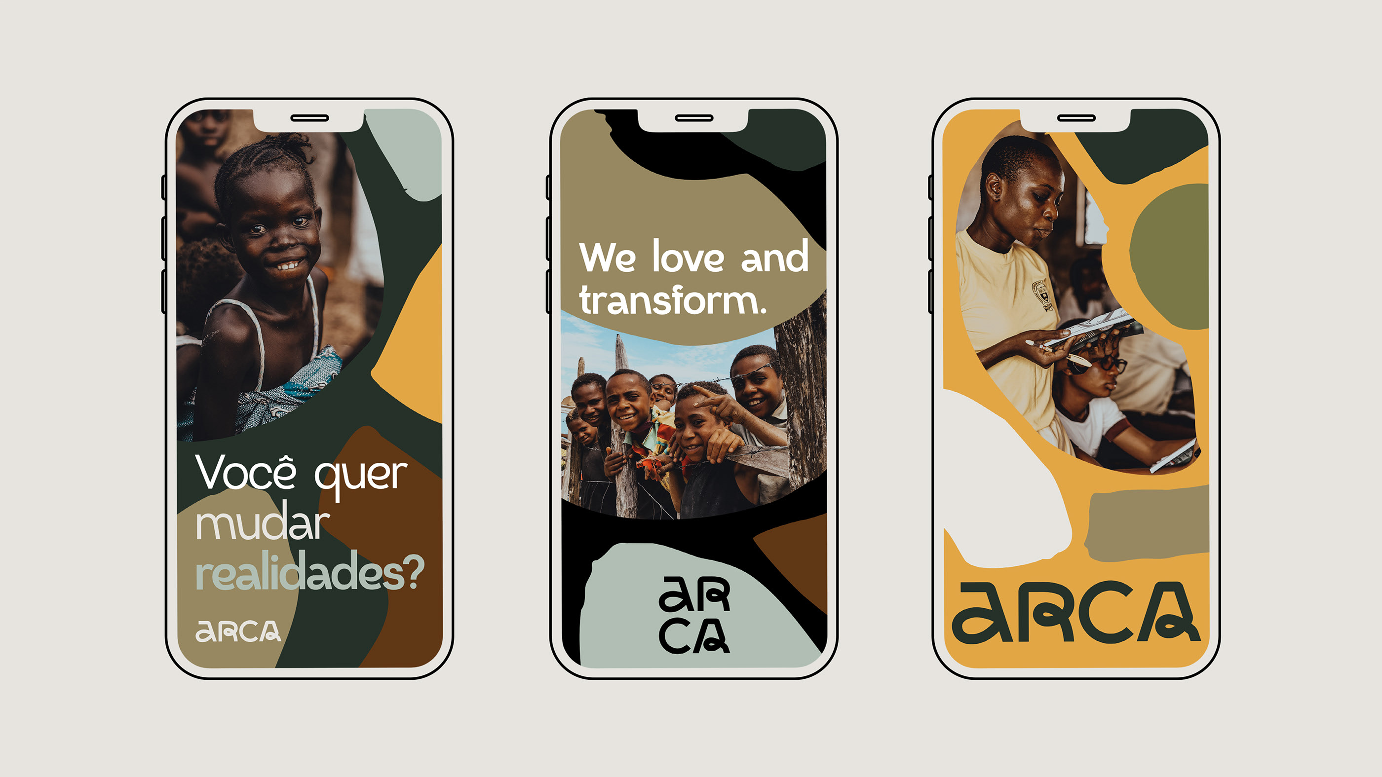
这个新视觉识别的另一个重要参数是寻找新的颜色,摆脱之前版本的原色,这给Arca带来了一种非常幼稚的感觉,新的颜色传达了人性、亲近、欢乐和自然。这些颜色很好地代表了巴西和非洲大陆。
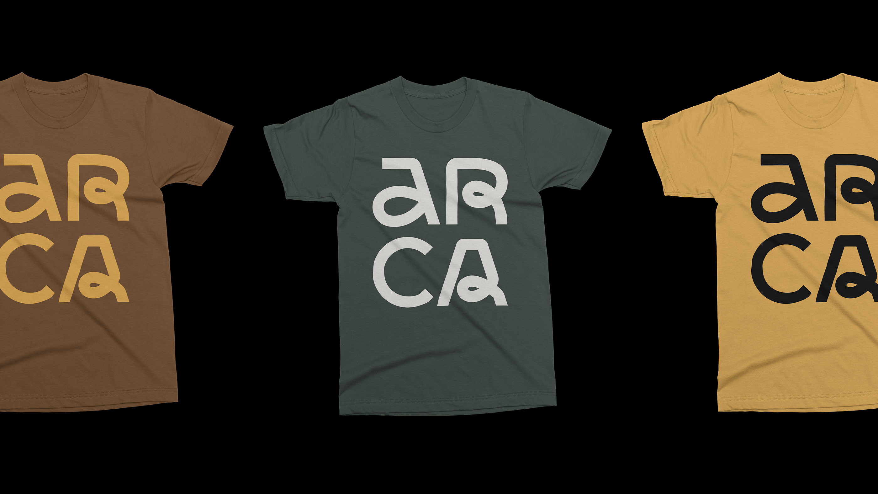
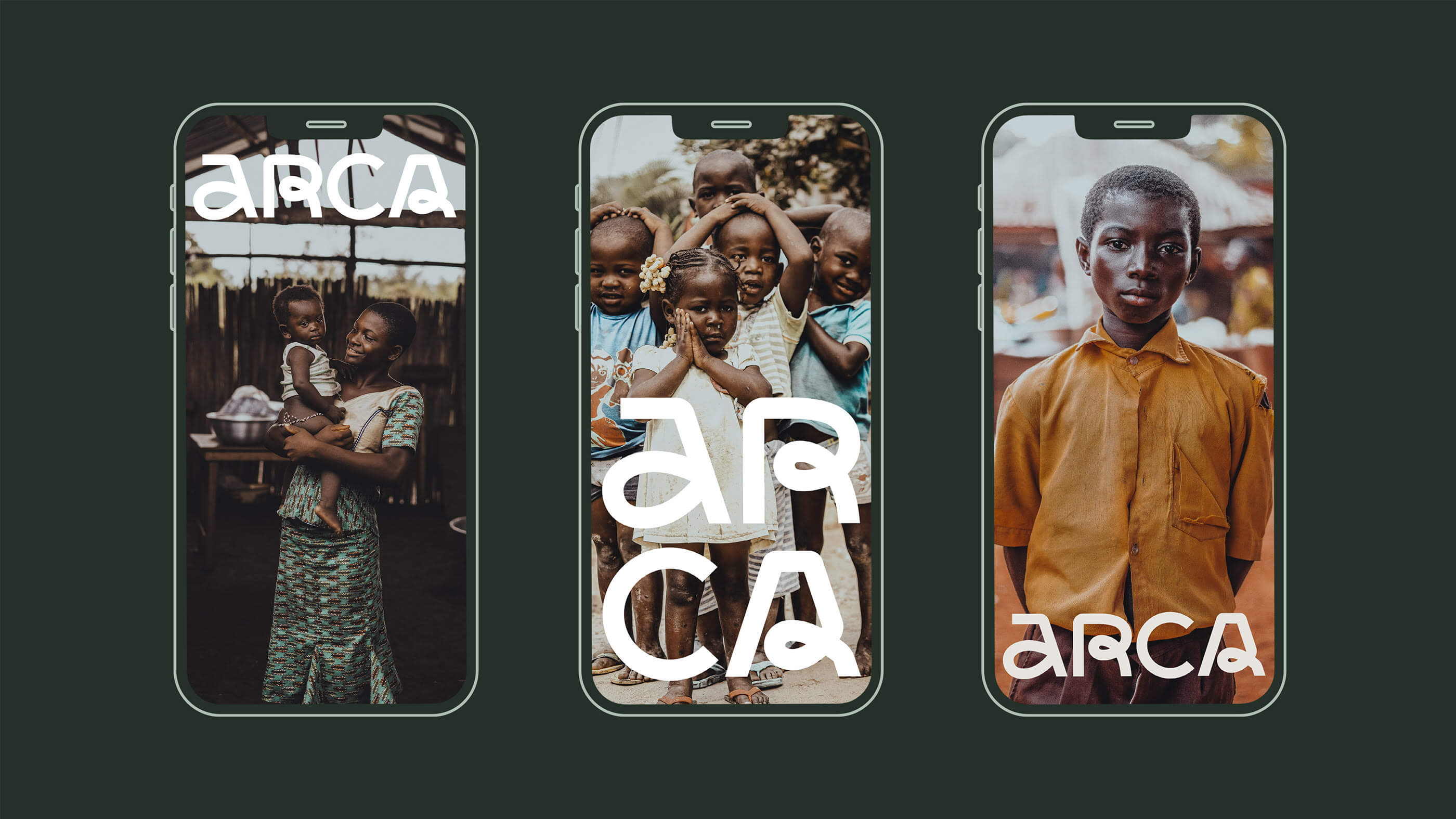
为了完成视觉识别,我们使用了一种更轻、更有趣的字体模式,它与非政府组织工作的人群很好地交流,也与企业市场沟通。
"Make an impact in the lives of people who need help."
Arca is a ngo born in Guarapari/ES - Brazil, which has grown and operates in Mozambique in Africa and in the future throughout the world.
With the ideal of changing the situation of poverty and changing all the evils that accompany this picture, such as: low nutrition, low education, illiteracy, and crime. These people need mechanisms, resources, and psychological support to change this condition, and Arca works to offer support so that these people can leave this vulnerable situation behind.
We sought to create a visual identity that had as its main column a clean and minimalist logo, different from the previous logo, this new logo provides an easier application and reading, besides being more modern, different from the previous one that was more rustic.
Another important parameter for this new visual identity was to look for new colors, running away from the primary colors of the previous version, which brought a very childish feeling to Arca, the new colors communicate humanity, proximity, joy and nature. These colors represent very well Brazil and the African continent.
To complete the visual identity we used one font pattern this a lighter and fun, that speaks well with the group of people for which the NGO works and also communicates with the corporate market.
*文内出现的文字、图片、知识版权属于其合法持有人。若无意侵犯您的合法权益,请及时联系我们处理。